A website for a Guatemalan restaurant family: four houses, one ancestral story, born in San Juan Ostuncalco, Quetzaltenango.
- Client
- El Adobe
- Industry
- Hospitality · Restaurants
- Services
- Web Development
- Scope
- Development of the approved design
01 / The challenge
El Adobe is not one restaurant. It is four houses, each with its own neighbourhood and character, plus salons for celebrations, all carrying the same family heritage.
Our job was to build a site that felt as rooted as the food, while still answering the practical questions fast: where, what's on the menu, and how to book an event.
02 / The thinking
Four houses, one family.
Centro Histórico, Zona Viva, Pasaje Naranjo and Antigua each needed their own identity without splitting the brand into four sites.
Heritage is the product.
The story, the Maya references and the craft behind each dish are why people choose El Adobe. They belong on the page, not in an About tab.
Hungry people are in a hurry.
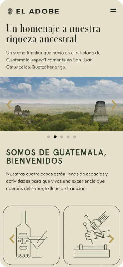
Most visits are on a phone, close to a meal. Menu, location and phone number can never be more than a tap away.
03 / The response
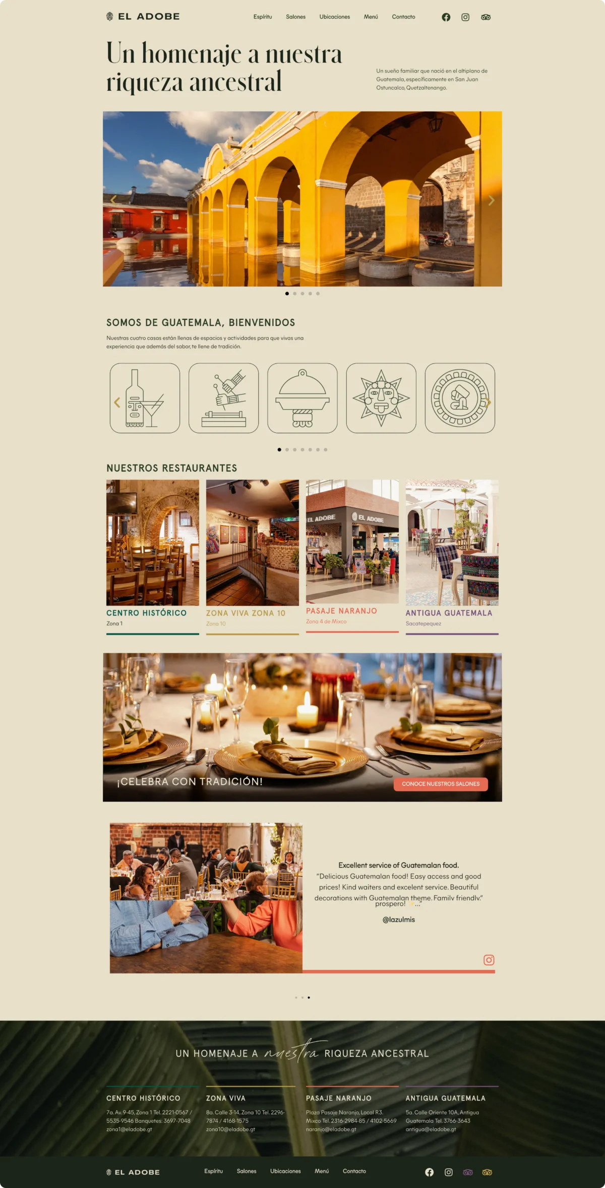
Starting from an approved design, we built a warm, editorial experience in earth tones: a welcome told through line illustrations, the four restaurants side by side, the family story, a bilingual menu and a clear path to the event salons.


04 / The build
Four houses. One table.
Each restaurant carries its own colour (green, gold, coral, violet) across cards, rules and the footer directory.
Line illustrations built into a responsive carousel that introduces the experiences at a glance.
A menu that switches language for international guests, led by photography of each dish.
A dedicated path from Celebra con tradición to the salons, for weddings, banquets and corporate events.
Addresses, phone numbers and emails for all four locations in the footer, on every page.
05 / The result
One home for the whole family of restaurants, as rich as the heritage behind it and as quick as a guest deciding where to eat tonight.
Measured impact